Layouts
Page layouts define the structural foundation of every page. They determine how many containers you can use, how these containers are arranged, and how your content adapts across devices. Layouts are fully responsive—while they may present multiple columns on a desktop screen, all containers automatically stack vertically on smaller screens such as mobile phones. Changing layouts never deletes containers; instead it adds or hides containers depending on the layout chosen.

Layouts define how containers are arranged on a page and how the page structure adapts across devices.
Select Layout
- Locate the Layout selector
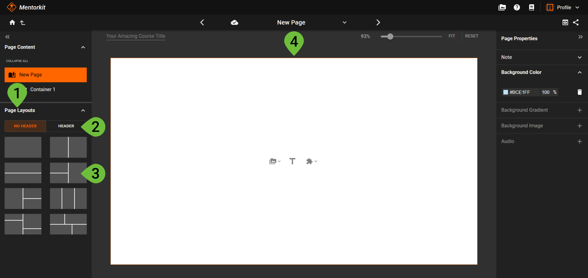
- In the left-side panel, open the Page Layouts section.
- Choose a Layout category
- No Header layouts include only the main content containers.
- Header layouts add a top container with different height rules.
- Click a Layout to apply it
- Switching to a layout with more containers adds a new container.
- Switching to a layout with fewer containers hides additional containers, but keeps their content safely stored.
- Add or edit content
- Click inside any container to place text, images, or other elements.
Change layouts anytime
When switching from a layout with more containers to one with fewer, additional containers are safely stored and restored if you switch back.
Responsive Behavior
All layouts are designed to be completely responsive. Containers displayed side-by-side on desktop will automatically stack vertically when viewed on mobile devices to ensure optimal readability.
Header Layouts
Layouts in the Header category include a special top container, ideal for titles, navigation elements, or page summaries. This container follows different height rules and is managed separately from the main layout containers.
Container Persistence
No content is lost when switching layouts:
- Containers outside the chosen layout are simply hidden.
- They return automatically when switching to a layout that includes them.