Drag and Drop
Use Drag and drop to create interactive tasks where learners move cards into the correct drop zones. This exercise type is useful for matching, grouping, and classification tasks where learners must place items in the correct category.
A Drag and drop task consist of:
- Cards
- Drop zones
- The connection between them
Only one drag and drop task can be added per page.
Tasks with many cards or large images may be harder to use on mobile devices.
Set up Drag and Drop
To add a drag and drop task, select Drag and Drop from the exercise menu.
A new drag and drop task start with:
- Two cards
- Two drop zones
To define the correct answers, drag each card to its correct drop zone.
Once a card is connected to a drop zone, that placement is used as the correct answer for the task.
Cards and drop zones
Cards are the items the learner can move. Drop zones are the target areas where cards should be placed. You can rename both cards and drop zones to match the content of your task.
Add cards
To add more cards, click Add new card. New cards appear in the alternatives list.
Add drop zones
To add a new drop zone:
- Select the Drag and Drop task in the layer list
- Click
Create new drop zonein the options panel
Remove cards or drop zones
To delete a card or drop zone, right-click the item and select the delete option.
Dummy cards
You can create dummy cards by adding a card without connecting it to a drop zone.
Dummy cards are incorrect alternatives and should remain in the alternatives list for the learner to answer correctly.
Styling drag and drop
You can customize the appearance of both cards and drop zones. This includes:
- Background colour
- Border
- Text colour
Use styling to improve clarity but keep enough contrast between text and background. If cards contain images, keep in mind that they may require more space than text-only cards.
Mobile behaviour
Drag and Drop tasks behave differently on smaller screens.
In mobile view:
- Drop zones are stacked vertically
- Cards appear in a card list or deck
When designing for mobile, use preview mode to check:
- How many drop zones are shown
- How many cards are included
- Whether cards with images still fit well
Keep the task simple enough to remain usable on small screens.
Exercise properties
Attempts
Set how many times the learner can attempt the task. Choose between 1–10 or unlimited.
Scoring

Set how many points the task is worth.
0 points means the task does not affect the total score.
Drop Zone style
Customize the appearance of drop zones.
- Background color
Sets the default background colour. - Hover background colour
Sets the background colour when a card is hovered over the drop zone. - Border colour
Sets the colour of the border. - Border width
Controls the thickness of the border. - Border radius
Controls how rounded the corners are.
Alternative style
Customise the appearance of the cards.
- Card background colour
Sets the background colour of the cards. - Card text colour
Sets the colour of the text inside the cards. - Card border colour
Sets the colour of the card border. - Card border width
Controls the thickness of the border. - Card border radius
Controls how rounded the corners are.
Feedback Response
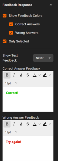
Control what feedback is shown after the learner submits an answer.
- Enable or disable feedback using the available checkboxes
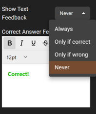
- Choose when feedback text is shown:
- Always
- Only if correct
- Only if wrong
- Never
The default setting is Never.